Looking back in time can often turn out to be quite helpful when you want to find out how you can individualize your personal style. At a time when everybody wears things a certain way you can ensure to look classic, yet different enough to stand out from the crowd.
In the past, I analyzed ads from the 1930’s in the U.S., checked out hats and illustrations but today, I want to focus on German ads from 1937.
Odd Combinations
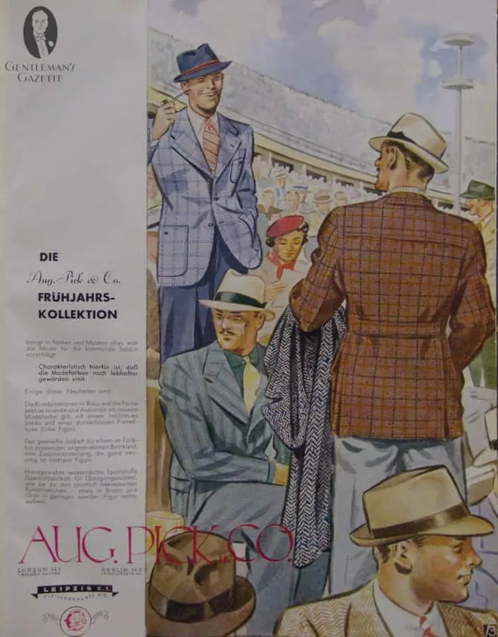
This ad from Aug. Pick & Co. shows us soem beautiful fashion illustrations of upcoming spring summer illustrations. At the time, they had premises in London W1 at 1. Golden Square, Berlin W8 Leipzigerstraße 24 and in Leipzig C1 Fleischerplatz 2-5. Sadly they are not in existance anymore.
What you can learn from this illustration?
1. Blue is the most popular color in menswear today, yet the blue outfit on the left is absolute unique. He combined a mid blue pair of pants, with a light pastel blue sportcoat with an interesting double windowpane. The look is very refreshing and you should try to combine your suit pants with odd jackets for a different look.
2. If you look at the color combination, you see, blue, white and orange. You can also mix and match colors, but it pays not to overdo it. This chap as a blue hat with and orange band, and orange tie and orange in his shirt. It is certainly different, but very classic.
3. At that point in time, striped jackets were only worn as a suit, never as an odd combination. The gentleman in the middle combined solid trousers with a striped jacket and paired it with a dark shirt, bright tie and a collar clip. You can combine your striped jackets too, but bear in mind that the stripe must not be too formal. For example, a navy pin stripe suit will not work with a pair of khaki pants. Instead, mix a grey flannel chalk stripe with a pair of blue trousers. Keep enough contrast without going overboard.
4. The man on the right shows us the half belted back of his jacket, which is a distinct feature of a sport coat. Here, he pairs it with a tattersall shirt, a bold herringbone overcoat and a light grey pair of slacks. It works really well together, because the pants are neutral and work with almost anything. You should also invest in a light grey pair of pants, because you will be able to combine it with all kinds of colors including blue, brown, red and green.
5. Sportcoats look better with patch pockets. Most sportcoats today are cut like a suit jacket because it is more economical to cut all jackets the same way. However, I really like the look of distinctive features for sport coats and city suits. Not only is it fun to have different elements in your wardrobe, but it also allows you to dress appropriately at all times.
Duke of Kent Silhouette
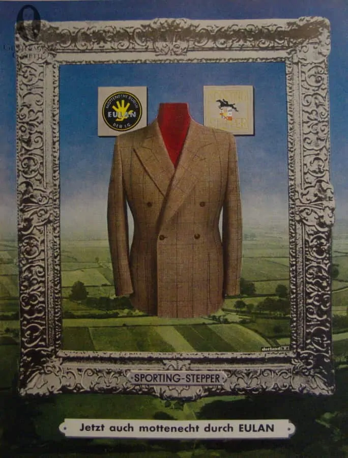
Today, most double breasted jacket either com in 6×2 or 4×2 meaning that you either have a total of 6 or 4 front buttons with 2 closing buttons. An often overlooked and forgotten style is the Kent Silhouette, which is just 4×1. In order to make this look work, the closing button row should be on the waistline or slightly below, and the top buttons have to position further out. This example is perfect and since you generally cannot find this style of the rack, it is a subtle hint that your garments are bespoke. Also, note the checked fabric with a subtle windowpane, what a beautiful fabric.
Why you should wear a Duke of Kent style jacket?
1. It is perfect for the gentleman who already has a range of different jackets in his closet. The 4×1 silhouette is very masculine and powerful, yet unique and refind.
2. Chances are nobody else will have a jacket in that style.
3. A double breasted silhouette is per se always more formal than a single breasted one but in this case the combination with brown makes it a bit less formal and hence you can wear it for almost any occasion.
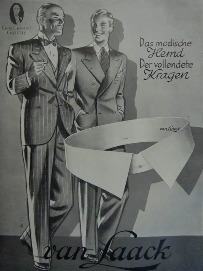
White Shirt Collars by Van Laack
White Collars were by far the most used collars in 1937. Unlike today, men preferred to proper look of a stiff, white detachable collar. The advantage of it was, that you could combine any shirt with any collars, which meant one had many options. The big collar you see here was a classic spread, not to wide, not too small and the shape could be worn today just like that.
Today, it is very difficult to find stiff collar shirts, and you either have to have them custom made or buy them from England. The stiff detachable collars themselves need a special form of dry cleaning and most dry cleaners are not able to do that anymore. As such, it is difficult and bothersome to go for this look.
What you can learn from this ad?
1. Classic collar shapes never go out of style and you can wear them indefinitely
2. The white collar, can be a great contrast on a patterned or contrast colored shirt. It works well with business suits and adds a more formal touch.
3. Your shirts always wears out first on the collars and cuffs, but the body is still perfectly fine. Don’t just throw the shirt, but have a white shirt collar and double cuffs attached to it for a different look.
4. Shirts with white contrast collars and cuffs are called Winchester Shirts.
5. Van Laack is still going strong in Germany today, although they no longer offer detachable collars.
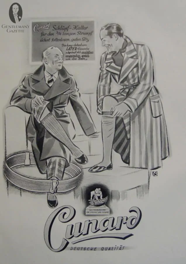
Sock Suspenders / Garters by Cunard
In 1937, sock knitting machines were not as technically refined as they are today. Moreover, the use of elastic materials was just in its infancy, and so over the calf socks would often slide down. Cunard was one of the suppliers of these sock garters or sock suspenders.
What you can learn from this ad?
1. At the time, you needed suspenders to actually keep your socks up
2. Today, well made over the calf socks will stay up without garters or suspenders.
3. If your socks slide down, get either longer socks, or better socks, or both. All Fort Belvedere Socks are quality, over the calf socks that come in different sizes and were designed to stay up all day.
4. Investing in sock suspenders or garters is pointless unless you want to dress in period costume.
Tie & Color Matching
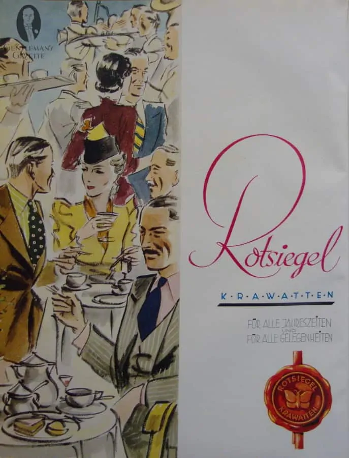
On the left, you can see a tie ad from the now defunct Rotsiegel company.
What you can learn from this ad?
1. Matching the right colors is often underutilized or executed poorly in menswear. But just look at the chap in the bottom right. He wear a striped grey three piece suit with a navy tie. This ensemble would work with a white or light blue shirt, but the light pink really makes it shine, in a subtle, understated way. If you have a grey, suit, you should definitely give this color combination a try. The perfect tie for this would be the navy fresco tie from Fort Belvedere.
2. If you have conservative ties in dark blue, try to combine them with unusual colors. The man in the middle wore his dark navy, white and red tie, with a chartreuse shirt and a brown jacket. While I am personally not overly fond of this color combination, you have to try things out to create a dashing look, and not every combination will be your best, but that’s ok. You will only improve your look if you try over time. Rome wasn’t built in a day, and you cannot transform your style in on day either, but consistent work and effort will pay off.
Pattern Matching
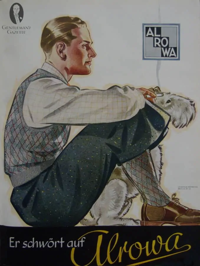
This chap is wearing plus fours made of a donegal tweed, saddle shoes, over the calf socks, a knit vest and a checked shirt.
What you can learn from this look?
1. You do not always need a jacket to look stylish. A vest or a sweater vest will make you look dressier than if you just wear a shirt.
2. Saddle shoes are an interesting shoes that works well for casual outfits. If you have all the basics in your shoe closet covered, consider investing in a saddle shoe.
3. When you combine patterns, make sure the colors and the size of the patterns don’t clash. Here we can see donegal plus fours with little knobs. the Shirt checks are simple but much larger than the knobs, whereas the vest and socks have a special diamond pattern with smaller lines that makes the entire ensemble work together. When you start out. I recommend not to combine too many patterns and colors at once. Start with 2 and take it from there.
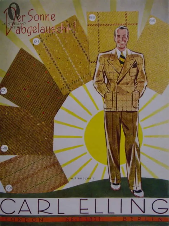
Select Interesting Fabrics
Fabrics are manifold and wonderful. They come in so many pattern, color and weave combinations that you have an endless supply. Once you have a navy solid and grey stripe, go for something brown with an interesting weave that is versatile, and I promise you will be able to wear it with all kinds of other garments. Khakis, suit pants, chinos, tweed, flannels…
In this pictures, you can see interesting stripes, donegal flecks and windowpanes. Combining all of that requires quite a bit of skill. If you start out, it may be wise to just go for one jacket in donegal tweed and then you can combine it with existing items in your wardrobe, such as solid.
Over time, you will feel more confident and develop your very own style.
If you liked this article, you will love our ebook Gentlemen of The Golden Age!
I consider fashion illustrations to be one of our guiding lights for style. Along with photographs, we can learn most of what we need to know. The exception would be eloquent discourse from those with a studied eye. THat completes it.
Interesting. I never thought the Germans were very imaginative about much of anything tonsorial. By the way, “unique” is a unique word: something is either unique, or it is not, but unique is never used with a modifier like “very”.
I like the vintage adds, the illustrations make men’s ware so classic and refined. These adds remind me of the old movies of the thirties and forties, and because the movies were in black and white, the color adds, give you an indication of what colors they may have worn. Plus any contemporary men’s ware catalog offer good examples of good style.
A wonderful & fascinating article. I have been using vintage ads for some time to guide my fashion ideas. Another good source are vintage movies. I was surprised, in one film, to see a gentleman wearing his Homburg with a dinner jacket! I love your site. David. x
Great article, as always. Please do use more period illustrations, particularly from European source. If you do not know it, there was a French magazine called Adam with some great illustrations of the French styles in the 1930s. Unfortunately, not in color in the issues I have seen. Keep up the great work of maintaining and spreading the appreciation of the classic styles.
I like both the older ’30s through ’60s illustrations and photos as well as modern ones. I think the ’70s, ’80s and even ’90s can be forgotten and the 00s are closer to modern but more bland. When one of the top Grammy winners is wearing a very nicely tailored blue windowpane suit, you know classic fashion is back.
I absolutely love the vintage ads and references. I have collected vintage clothing for over 30 years and am aware that our modern classic stem from the golden age of fashion, the 1930’s! What could be interesting is some modern equivalents to the vintage references. What is so wonderful about vintage clothing is the cut, construction, and the fabrics offered. The modern equivalents often cost in the thousands which only makes the vintage items more dear.
Overall, I appreciate what you all are doing to educate our younger guys in how to dress well, with style.
Thanks again!
Yes -BOTH, would prefer it if you would use more fashion illustrations, AND more modern day photography…
You have to look to the past for inspiration with fabrics style and seasonal direction , this can re emerge and create fantastic opportunities to move forward .
Hi Raphael. I enjoy the illustrations and the modern day photos. This was another great article. Keep them coming!
I love your historic fashion illustrations. Fascinating to look at but full of interesting ideas for colour combinations
A few remarks:
Your illustrated drawings do not come across well online. They are too small and do not depict the colors and patterns in the same way that is obviously more visible to you.
A second set of eyes would be a good idea for you to have review your own text. There are only one or two typos, but this is a commercial post and really should be as stellar in professional appearance as the style advise you give.
Lastly, there is NO SUCH THING as “very unique.” I assure you I am correct. Do not follow erroneous trends being uttered of late by the masses. It is incorrect, so don’t type it or state it orally. And I hope, when you speak, you are not pronouncing the “t” in often.
Sincerely, Jan Grossman, Esq.
1. You do realize that you can click on them to make them larger, right? If we made them bigger, they would not fit on most people’s screens. Also, we would have slower load time and pay much more for bandwidth.
2. Even if you qualify this post as legally commercial, I would argue it is not. It is free for you to read and it helps you to understand certain basics. There are no sales pitches, just helpful links. If you paid for reading it would be different.
3. We do have proofreaders, but as everybody who writes articles or books knows, you will never find all the mistakes. If you spot some mistakes, please point them out so we can correct them. General remarks like “get a proofreader” are utterly useless.
4. Very true about unique. It should have been absolute unique.
Raphael, I personally much prefer the vintage fashion illustrations to modern day pictures. The ads used in this article are great. Thank you.
I love seeking inspiration from Apparel Arts and vintage ads. I thoroughly enjoyed your commentary on these illustrations. Would love to see more. Thank you!
Yes, please continue with the period illustrations. They show that classic style carries on a distinguished aesthetic tradition. Using them also sets this site apart from most other menswear commentary. Don’t give up on photography, however, especially from Pitti Uomo and similar scenes where men give rein to style.
It would be fascinating, and probably helpful, to see the illustrations matched with photographs showing the contemporary style equivalents.
I’m struck that the German ads depict looks so similar to American menswear fashion of the day. Could the common denominator be London?
I like the fashion illustrations. It sets you apart and makes you unique in this field.
While it may sometimes be either difficult or impossible to combine vintage illustrations with photographs of modern interpretations, I would love to see it, when possible. If there is a site out there capable of doing it, its this one. Thanks for all you do.
As usual, excellent job SRS.
In this period, men wore hats. But social etiquette was such that men would remove their hats indoors (or for other reasons) frequently. When this happened, their hair style permitted this action without resulting in a messy hair look. It would be really nice to see you guys do a post on the dynamic of wearing one’s hair in a manner that is complimentary with wearing a fedora regularly. I am also interested in hearing what hair products keep one’s hair from appearing too glossy/shiny or greasy. Sven’s hair usually looks pretty good. I’m sure he has a lot to share regarding this issue. Thanks for whatever you guys can do.
The illustrations are truly great but they disappeared from the ads in the late 40’s and were gone by the 50’s. 4Color photos of men’s clothing ads began to appear in American magazines starting in the early 60’s. I miss the old artistry but if you’re making a point about style today then, I think you can do it best with photos.
This article was by far the best yet! I feel that you should continue to use both, vintage fashion illustrations and modern day photographs.
I am an x-pat living in Cuenca, Ecuador. I was a engineer for Michelin . My question is this : When did the American male start dressing like total slobs? Today , they are laughable, in their dirty jeans and flip-flops and t-shirt . I have live in 9 countries and everywhere that I go the Americans are the sloppiest , fattest , and worst dressers in the world. I will not go to a restaurant that is frequented by “Gringos” . I am too embarrassed.
When did this downhill projector start ?
, Patrick Trussell
Please keep using vintage illustrations! Much better than current photography.
Love the antique ads. Yes, so much CAN be learned from them… I prefer them to current photos or ads since I find that there’s more room for interpretation and freedom while viewing old ads… Obviously we can’t exactly duplicate them today, but this allows us to “make them our own” using our own creativity, which then can support the ( with apologies to David W, the English teacher ) joys of creative self expression. New ads say “buy this” pretty much as it is, with little room to change it around or bring your own flair to it. New ads are about selling the products advertised, not about encouraging you to think for yourself.
Nice historical review. This will certainly guide and educate men of style and sartorial savvy.
These illustrations of thirties and forties are not only a wonderful opportunity of discovering great international artists, but also an source of fresh and innovative ideas concerning our passion about clothing. So please use more more often these pieces of art as a daily guide for us.
Keep on the good work.
I think there is room for both vintage fashion illustrations and photography to illustrate menswear. I’d certainly be sad if you stopped doing the vintage illustrations alongside more modern photos.
Fashion illustrations were always designed to provide inspiration and they still do. Of course not everything that was advertised in the past is due for a return or reinterpretation. Personally, I like them even when they simply provide a window into the past – such as the sock suspenders.
I love the illustrations. The period dress offers a fresh perspective, and the I appreciate the chance to consider some next moves for my own wardrobe additions.
I haven’t been on here very long, but I find all the information highly informative .
There can never be enough images when describing or explaining dress style of a bygone era ;
as the saying goes “the devil is in the detail” . One wrong detail or too much detail can change
right into wrong in one fell swoop .
Kudos to the author ; to those with dress sense & an eye for style, this site really is an oasis in
the desert of bland clothing.
I am in the process of having a 1940’s double-breasted suit made with great attention to detail,
photos I have found on here along with general do’s & don’ts really have provided me with a mine
of information . And saved a lot of misunderstanding with my tailor at a later date !
Strangely enough, the material is a very faint light grey herringbone with a navy chalkstripe .
(nicer than it sounds – no, really ! ) . The colour for the Spearpoint collar shirt was proving to be
not so much a stumbling block ( white / blue / grey / yellow ) but more of not-quite-right issue .
.
Hallelujah ! – as you will see in the article above, light pink shirt / navy fresco tie….
That’s it – game over ,
And so, it would appear that the fat lady has finally sung .
Best Wishes,
Both. Thanks for your diligent work.
Do pls. keep on posting – and deconstructing for us – these wonderful vintage ads.
So much to learn and so much better- and, odd as it may sound – more refreshing than today’s pictures.
Many thanks,
Fabrizio
Raphael ,
These articles with vintage fashion are just great ; this is what made me interested in your project .
The thing I like the most is how manly the men look and also that a man should step out of conformity a little and make his mark and be his own man .
I tell you what ; Women love it make no mistake .
I would be marvellous to see something like this appearing each month .
I know this is irrelevant but it’s been bothering me. My uncle keeps recommending J Crew. he insists that the materials are some of the best in the world and that it’s the best bang for my buck than I can get anywhere. He says he used to date someone that worked there and that their materials really are quality, but as hard as I try, I just don’t believe it. Do you know anything about this company?
As a menswear retailer, I have had to become a student of the business. Therefore, I certainly appreciate all of the articles pertaining to the vintage ads. Because it provides a reference point for historical context and gives us a sense of how a particular style originated and also how some may be still be relevant in fashion history present day. Great article for those of us who are ‘students’.
Also, please consider a return to a printable view for your articles. So that we may print them without the ads or the comments. Thank you.
I agree with those saying there is room for both antique and modern illustrations/photos. I think some topics may more naturally lend themselves to one or the other, whilst others will be suitable for both.
Excellent post. I prefer the vintage fashion illustrations. Your pointing out the “what you can learn” features is very useful — makes the content more valuable.
Like always an interresting article, wich let me answer your question this way, I’m not much interested in todays fashion. I prefer all the classic stuff and try to dress in certain occasions in the style of the 1930s/40s. As many period illustrations as possible helping to get an idea of that vintage fashion.
Good morning
What a lovely day. Back at work reading this article with a grey sky outside.
The illustration is a nice touch. I find that there is a good balance between photograph and illustration.
Thank you for a great article, as ever.
Regards
Brendan
I like this kind of article. The classic photos particularly, and I would like to see more.