Many of our readers have an affinity to 1930’s fashion illustrations from artists such as L. Fellows or Leslie Saalburg, and while we mostly discuss editorial pictures, I want to focus on fashion illustrations from magazine ads today.
Back in the day, it was normal for a publisher to design an advertisement together with the advertiser. Though as you can imagine, a magazine publisher could only employ a limited number of fashion illustrators to serve all their clients. In order to demonstrate each brand’s unique image, the illustrations were often very different from each other.
Interestingly, ads from the early 1930’s have a stronger resemblance of the 1920’s illustrations, which were more simplistic and relied more heavily on lines than details. Nevertheless, even during that time period, there were huge differences in drawing styles, and soon you would see illustrated ads that were just as nice as the illustrations you all enjoy so much.
Now, let’s discuss a few ads and styles:
Arrow Shirts
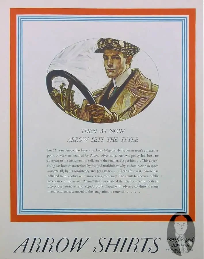
By the 1930’s, Arrow had established itself as a respected shirt manufacturer in the US.
This success was at least partly owed to the fabulous fashion illustrations by J.C. Leyendecker. On the left, you see a drawing in the typical Leyendecker style, featuring a high white detachable collar and a drawing style that is detailed yet very characteristic.
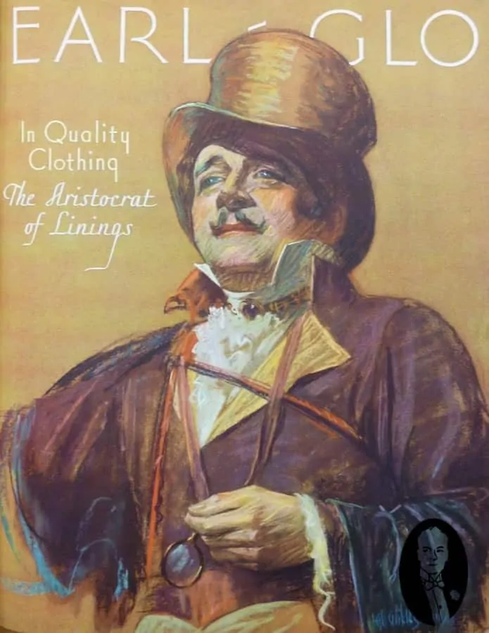
Earl-Glo
If you compare it to the Earl-Glo Lining advertisement, you can see the differences. At first glance, the Earl looks like the ad was painted in oil, but upon closer inspection, you can see that it was drawn by hand. In any case, the Earl looks more like a gentlemen from the 19th century, with his ruffled shirt front and cuffs, neck jewelry and Pince–Nez. I can only assume this
brand wanted to emphasize their heritage quality and so decided to use a historic motif in combination with a drawing style that implies glory. In combination with the golden background and the Aristocrat product description, the ad promised an upper class product of the utmost quality.
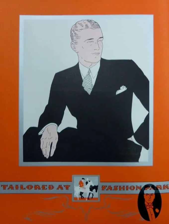
Tailored At Fashion Park
The gentleman in black is very different. The artist reduced the detailed area to the head and the hands, while the suit itself is all black. All you can see is the silhouette, which is still quite pleasing in my opinion. This way, the cuffs, pocket square, collar and tie really pop out.
Thermo Knitted Soprtswear
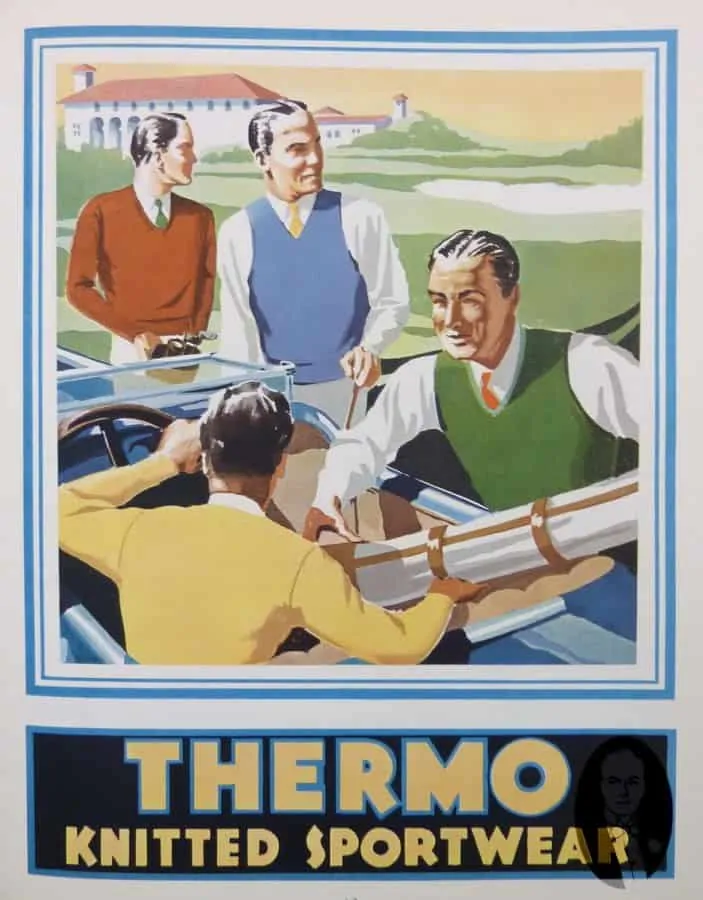
Thermo Knitted Sportswear chose an entirely different approach. Here, the contrasting color creates an eye catching effect. The faces of the men show high levels of contrast and only little detail, while the different sweater styles are clearly visible.
Palm Beach Suits – White Linen
Palm Beach Suits famously advertised the white suit, although they had many other colors in their portfolio. Their ads were usually black and white, showing people in their summer linen suits with Panama Hats. One of their selling points was the fact that you could wash the suit without shrinkage! In this ad, they even added a cloth sample so buyers could see what they would get. Today, this is would be farfetched,
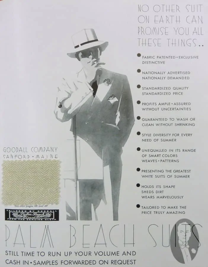
considering the amount of handwork required in the process of adding fabric samples to magazines. Ironically, the brand with the iconic West Coast name had their suits produced in Sanford, Maine.
Makransky Philadelphia
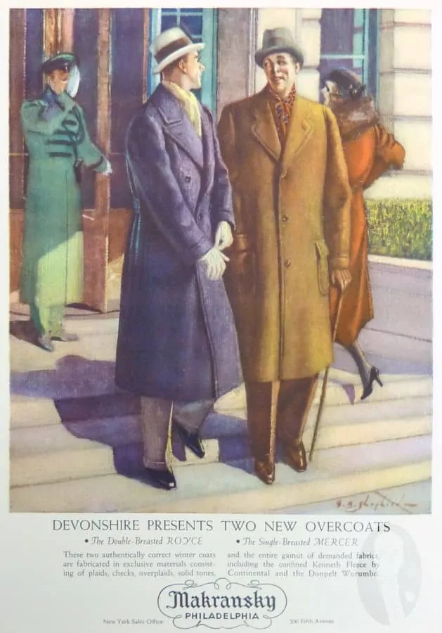
Makransky from Philadephia chose yet another approach to fashion illustration. The figures have a very soft look to them and the colors are slightly subdued. To me, it looks like a painting rather than an illustration. I really adore the colors of the gentleman on the left. He wears a blue Ulster style overcoat with a off white hat and matching gloves. The look is complimented by a yellow scarf and beige full cut trousers.
Frank H. Lee Co. Hats Danbury
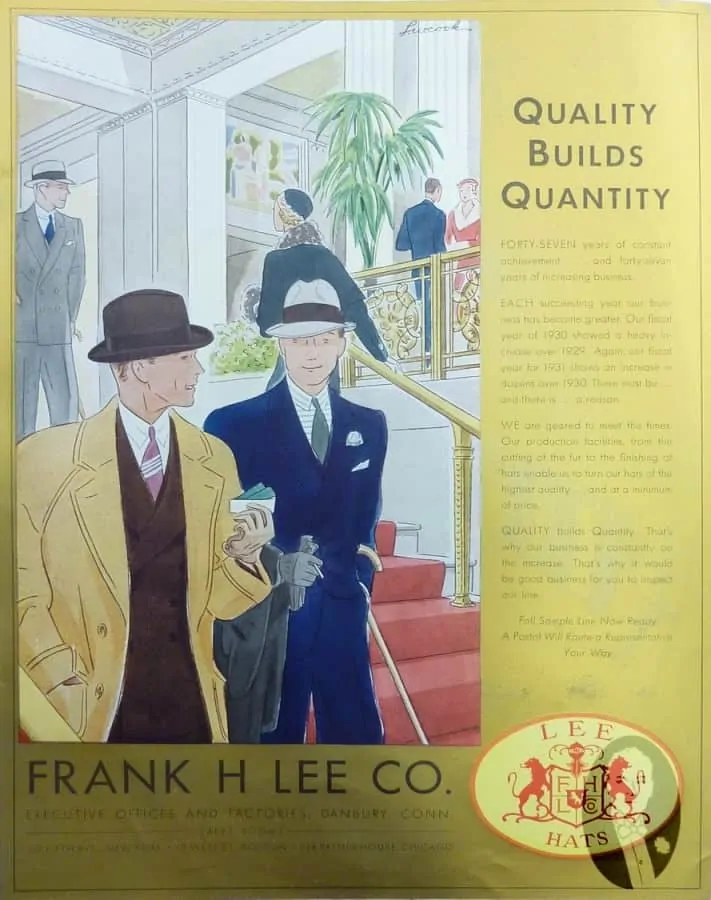
The Frank H. Lee Hat Company from the hatter town Danbury. Their figures have the minimalistic 1920’s fashion illustration lines, but the colors make all the difference. One thing I really like about these ads is their attention to detail: Frank H. Lee used to sell hats and you can specifically see a snap brim and a Homburg style hat, though the rest of the outfits is very interesting as well. The chap on the left wears a chamois yellow overcoat with raglan sleeves and notched lapels over a dark brown double breasted suit. His sand colored gloves are a great way to add the final touch to his look. The gent on the right wears a double breasted suit in navy and since he wears the less formal snap brim,
he combines it with a horizontally striped shirt, boutonniere, pocket square and grey gloves.
Conclusion
Overall, there were numerous styles of fashion illustrations in the 1930’s that were utilized in magazine advertisements. Soon, photography would make a huge impact on the industry and fashion illustrations vanished entirely. To me, they are a lost art form; I always enjoy looking at these elegant illustrations. What do you think about these ads?
Men’s Fashion Illustration Guide
Marvellous. These drawings inspire and are the remaining signs of a different aesthetic sensibility. Look at the streets today…
Things are indeed quite different today – often for the better, and regarding clothing for the worse…
Dear Raphael,
Aside from Lydendecker working for Arrow Shirts and Kuppenheimer Clothes, other celebrated poster artists ventured into menswear advertising.
Edward Penfield is widely known for his Harper’s Magazine posters which came-out monthly in the 1890’s. He also did posters for Hart, Shaffner & Marx. These posters are interesting in that the images do not focus on the clothes but on “life style.” I shall have to send to you a picture of his poster of carriage in front of the New York Public Library.
The Penfield posters will be the subject of a forthcoming book by Jack Rennert, a noted expert on poster art.
Another famous posterist, James Montgomery Flagg did occasional clothing posters. I shall send to you his remarkable poster for Lee Hats. It is pure image with no text.
Dear Mark,
Thank you for your in depth comment. I look forward to your message. Best, Raphael
That thermo knitted sportwear one is great, it reminds me of the style used in the classic george ham posters he did for the Monaco grand prix and some posters put out by redwood creek in the retro style.