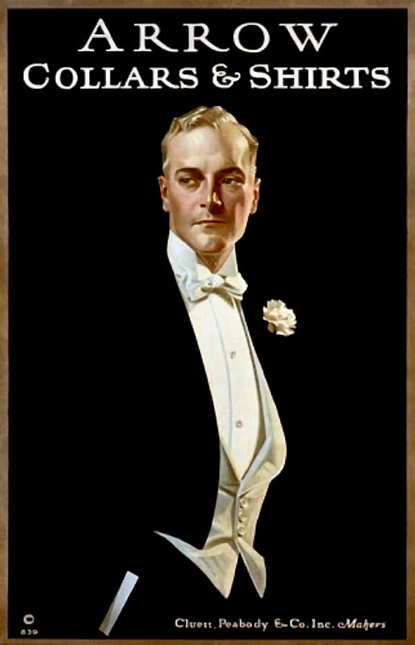
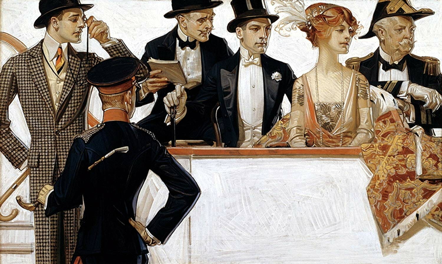
An illustrated biography of German-American artist J.C. Leyendecker (1874-1951) sets the stage for his rise to fame:
To better understand the overall impact of J.C. Leyendecker, and of illustration art in general, one must recall the context of the age when illustration was the only way for the public to receive images. Harper’s and Scribner’s magazines were the first to use wood engravings for their covers, as selling tools. Other periodicals soon jumped on the bandwagon, and before long they began to print pictures inside as well.

Seeing their illustrations so enthusiastically received by readers, publishers tried images on posters and in advertisements, to a delighted public.
The half-century period between 1895 and 1945 was an era of unparalleled excellence in book, magazine, and advertising design. During this Golden Age of American Illustration, masters of the art created a visual history that not only captured viewers of the time with its intensity, style, and vividness but impressed on the life of the nation a distinctive stamp that has endured to this day. And no Golden Age artist made more of an impact than J.C. Leyendecker.
Over the course of his career, Leyendecker illustrated the covers of numerous magazines including 322 covers for Saturday Evening Post between 1899 to 1941, more than even his protégé Normal Rockwell. But he is equally well known for his contribution to fashion illustrations thanks to his advertisements for menswear manufacturers B. Kuppenheimer & Co and Cluett, Peabody & Company, maker of Arrow shirts and collars.
In 1905 he convinced Cluett’s advertising director to utilize a single male image to represent all of their products. The result was not only the first major branding initiative in advertising but also the first real advertising campaign ever launched. The campaign featuring the devastatingly handsome “Arrow Collar Man” was so successful that Cluett grew to a 96 per cent market share, putting much of their completion out of business. Says the biography, “These images of a sophisticated, elegant gentleman resonated with millions of viewers and sold to an eager society the idea of a glamorous lifestyle that helped mold the Roaring Twenties.”
Some of his Leyendecker’s most striking work can be seen in his illustrations of men’s evening wear which have become so iconic that many of them are still sold as posters today. Here is a collection of the best of these illustrations. (If some of them don’t look much like ads it’s because Leyendecker’s technique was to first paint the image on canvas then have it reproduced in multiple ad and poster formats by the client for whom it was commissioned.)

Excellent. And interesting too. I didn’t know about Leyendecker. I love the two-part “piano” one!
Sent from my iPhone
Yes, although I’ve seen some of those illustrations before (reused as a book cover in one instance) I’d not heard of Leyendecker.
Rockwell whose style is similar – although his subjects never so grand and often more homely – has remained significantly more famous, whilst other artists – such as Lawrence Fellows – from journals such as Apparel Arts and Esquire have become the darlings of the internet’s menswear bloggers.
The Movie posters for The Sting were done in Leyendecker’s style.
I like this blog post. It reminds me that many of my dress shirts from elementary school through high school were from Van Heusen as well as Arrow. In fact, the very first tuxedo shirt I had was an Arrow with a semi-spread collar, French Cuffs and a three-stud front! It was an absolutely difficult shirt to get into, due to the studs always fighting me, but once I figured out how to make it work, I had no trouble. (A young impressionable high school kid always has problems with his first encounters with Black Tie) What I especially remember about this shirt was how stiff it was, making it look absolutely breath taking under my midnight blue velvet jacket. The French cuffs looked beautiful closed with black onyx links that I still wear with my tux shirts today; that fold line peeking out of the jacket was great and when worn with a velvet bow about the size of the current generation of bow ties, the whole ensemble just made me (can’t exactly picture it happening now-too much time has gone by) a babe magnet. I had more girls oogling over the fact I would wear a tuxedo to events than the other males, and to top it off, I actually wowed a few friends’ mothers because I looked better than their own suited sons. Believe me when I say that those boys were made to go and pick up some similar looking clothing so our DeMolay chapter would look better than the other two chapters in the district. We did too, even though many of the guys wound up with (Awk!) the dreaded white ruffled shirt. But then,it was the 70’s and it was high school and none of us (other than me) were inclined to maintain tradition. For me, Arrow shirts advertising always brings back a lot of fond memories.
Absolutely beautiful illustrations capturing the elegance of a bygone era. Once again, I have the distinct feeling that I was born too late. Thank you for posting these treasures!