
A quick look at any celebrity tabloid magazine will show you that various celebrities like Christian Bale and George Clooney frequently wear monochromatic looks on the red carpet and elsewhere. And let’s not forget the tone-on-tone look popularized by Regis Philbin around the turn of the millenium–it even spawned a clothing line from Van Heusen! But our question today is whether these sorts of looks have any place in the wardrobe of a gentleman who follows the tenets of classic style, and if there are better types of outfits that could still be considered monochromatic.
What Does “Monochrome” Mean?
The word “monochrome” is derived from the Greek “monokhrōmatos” meaning, of a single color. Actually, the word “of” is important to latch onto here. It suggests that all of the elements of color may not be exactly the same, but are just derived from the same source color. Another definition of monochrome is used more in fields like photography, meaning something that is rendered in black and white. However, in the world of menswear, black-and-white looks correspond more to evening formal wear like black and white tie, so we won’t be talking about them here.

Monochrome Menswear
So, what are we then considering a monochromatic look to be? Essentially, it’s a look that is, again, derived from one color. However, not all elements of the outfit have to be in exactly the same tone, like all black or all navy, for example. Rather, said elements can use tints or shades of that color. A tint is where white is added to the regular hue, and a shade is where black is added. For more color theory, check out our color wheel overview.

In addition to it being a misconception that a monochromatic outfit must feature pieces that are all in exactly the same shade, it’s also a misconception that everything in the outfit has to be a solid. You can incorporate patterns and textures into different garments–more on that below.
Do’s and Don’ts for Monochromatic Outfits
Don’t: Wear Exactly the Same Shade or Tint
Let’s use the aforementioned all-black or all-navy outfits as examples here. One of the reasons why you should avoid attempting a look like this is that it is going to be extremely difficult to match the blacks and navies in the same outfit between different garments. This is because different garments are composed of different fabrics and are also dyed differently. If they are not coming from the same manufacturer or are in the same fabric treated with the same dye, their color won’t be exactly the same.

The fact that you’re going to be wearing various garments that are almost the same color, but not exactly so, will leave people thinking something is just a bit off about your outfit–refer again to the photo of Christian Bale featured above. Another reason to avoid looks of this nature: if your outfit is comprised of all elements of one single color, your body is just going to recede in photographs. You will look like one large mass and there won’t be any definition to your form.
Do: Try To Experiment with Patterns and Textures
With exceptionally dark colors like black and navy, patterns and textures aren’t going to stand out that much, so trying to incorporate some visual interest using these techniques won’t help if your base color is exceptionally dark. Trying to assemble a truly monochromatic outfit like this can be seen as sort of an “easy out” in the fashion world, but isn’t great for the reasons we’ve outlined above. In other words, Christian Bale’s all-black red-carpet look and Regis Philbin’s Who Wants To Be a Millionaire? wardrobe aren’t really smart style choices. No disrespect to either of these talented guys, though!

Do: Choose A Base Color That’s Not Too Bold
For a more monochromatically inspired outfit, we recommend that you try to choose a base color that is not so bold. For example, instead of centering a monochromatic outfit around black, think about using the grayscale more broadly. In addition to the grayscale, you could base a monochromatic outfit around staple colors in menswear like blue or brown, or also go for something like green or even burgundy. Phrased another way, it’s easy to assemble monochromatically inspired outfits around neutral tones or tones that occur in nature.

Do: Wear Different Tints and Shades of Your Base Color
Also, we recommend that you wear various shades and tints of your base color in a monochromatic outfit. Varying the brightness of your source hue in an outfit is going to keep everything in the same harmonious overall mode of color, but it will also provide some definition and visual interest between the various elements in your outfit. And as we said before, do try to experiment with textures and patterns in your monochromatically inspired outfits.

Don’t: Put On Too Many Layers
As you’re trying to maintain harmony between the different pieces but also stay centered around the base hue, the difficulty will increase with the more pieces you add. Also, if you’re incorporating patterns and/or textures: the more garments you add, the more difficult it is going to be to keep everything harmonious. Sometimes, if you are going for a monochromatically inspired look, it’s better to keep things simpler.

CONCLUSION
With all that said, though, our final “don’t” today is this: don’t feel like you have to rigidly stick the rules we’ve outlined. While we do think that the guidelines we’ve put forward will help you to successfully build monochromatic outfits that look good, at the end of the day you can still wear whatever you think will make you look best. After all, if what you’re wearing is making you feel confident and more like yourself, that’s the main objective.
Do you find these styling tips helpful? How do you assemble monochromatic outfits? Share with us in the comments below!
Outfit Rundowns
To round out today’s guide, here are a few different examples of monochromatic looks to give you a better idea of how to pull them off well.
Outfit #1
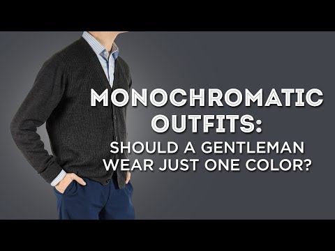
The first one is, of course, the outfit that I am wearing here today. My trousers today are in a shade of medium blue that you could consider as sort of central or base tone of blue color that sets the standard for the outfit. Meanwhile, my shirt incorporates a pattern of a lighter blue and white stripe. As I said before, my cardigan is on the dark side of the blue spectrum and it does also incorporate some elements of gray in its weave. The main color of my socks is actually lighter gray but they feature light blue as their shadow stripe so they still work within the blue color family.


I do not happen to own a pair of blue shoes, at least, not yet so I have rounded out the look today with a pair of gray suede Derbys. They harmonize with the socks and with the gray elements in my sweater and the suede does provide a bit of a textural element as well. So I suppose you could technically say that my outfit today isn’t truly monochromatic because it’s incorporating a good deal of gray but it still gets the point across. By the way, we have a guide on specifically pairing gray and blue together, which may interest you as well.
Outfit #2
The second example outfit uses brown as its central or base color. Again, the trousers are sort of in the middle here with their chocolate brown shade being darker than some elements and lighter than others. The camel hair sport coat, of course, reads as tan and its buttons are also in a darker brown. Underneath it is my off-white shirt which, taken with all of the other elements of the outfit, reads as if it’s in the brown family. My brogued derby shoes and my belt are both in medium brown leather and my pocket square is in a very dark brown, it’s the darkest element of the outfit. My bow tie from Fort Belvedere is woven in a houndstooth pattern and it incorporates off-white and dark brown.


Also reading within the brown family are the edelweiss boutonniere and the cufflinks in an eagle claw design that feature a tiger’s eye as the stone with gold metal. You can find those cufflinks and the boutonniere in the Fort Belvedere shop, as well.
Outfit #3
Our third example outfit again uses blue but it is a bit more complex. The boldest element is the rowing blazer which features broad stripes in blue and black. The light blue shirt is solid to ground things a bit and the mottled blue knit tie provides a textural element. The pocket square is in a lighter blue and it also features some paisleys in a pattern for another visual element of contrast. The belt is in a blue fabric accented with some brown leather and the gold buckle which also harmonizes with the gold monkey’s fist knot cuff links, also available in our shop.


Rounding out the outfit are the trousers which are light blue chinos and some blue suede chukka boots. As you can see, there are a few non-blue elements here and there around the outfit but the main pieces of the ensemble are definitely blue and everything harmonizes together despite the fact that this outfit is more complex than the one I wore here today.
Preston’s brown outfit and Raphael’s blue outfit are both good examples of how to put monochromatic pieces together. I don’t find Preston’s blue outfit, if that is what it is supposed to be, to be a good example at all. First, the sweater has very little hue; it is nearly charcoal. Second, and much worse, it appears to be greenish, not bluish, which clashes painfully with the blue trousers. And finally, there is insufficient contrast in brightness between sweater and trousers. One thing that the other two, more successful outfits share is a contrast of brightness between top and bottom: Preston’s brown outfit pairs a light coat with dark trousers, and Raphael’s blue outfit, a dark coat with light trousers. Preston’s dark greenish sweater is only slightly darker than the dark-blue trousers and is just far enough off-hue to clash with them. Sorry, Preston, but I find the combination very unsatisfactory and even a bit distressing to the eye.
Christian Bale looks like he got caught in a rain storm and his jacket shrunk three sizes. All black does not help either. Not a good look.
I don’t know why, but the photo of Raphael in the rowing blazer looks a little top heavy to me? Is it the angle of the photograph? The stripes?
I think the impression you have is due to the expectation of a darker color on the bottom (trousers)–typically top and bottom are either the same tone (navy and grey) or lighter on top, darker on the bottom (grey jacket, charcoal trousers).In this case, Raphael is wearing a light pair of pants with a dark jacket. Usually, darker colors are more grounding, which invites their use as a base, but reversing the trend is perfectly acceptable (think white trousers and blue sport coat in the summer).
I think the monochromatic look will be difficult for most people to achieve successfully. I also, think that it is best left for artists and musicians or people in their circle. Such as, their managers, promoters, and bodyguards. As for professionals handling my money , bankers, lawyers, accountants, I would prefer they look more traditional.