In continuation of our Pitti Uomo coverage, I’d like to show you more pictures with details today.
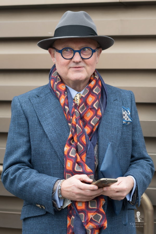
Using bold colors is one way to stand out, opting for unusual textures another. The latter is less flashy as it looks like a solid color from afar. This overcoat has a looser weave and a nice texture with twisted yarns in different colors, lending the coat a beautiful look. The oversized scarf print is bold and larger in scale than the tie and pocket square. The sport coat underneath is also textured, and altogether this gentleman is certainly not under-accessorized. While it is an unusual combination, I think a few accents less would have made the outfit even better. Sometimes less is more.
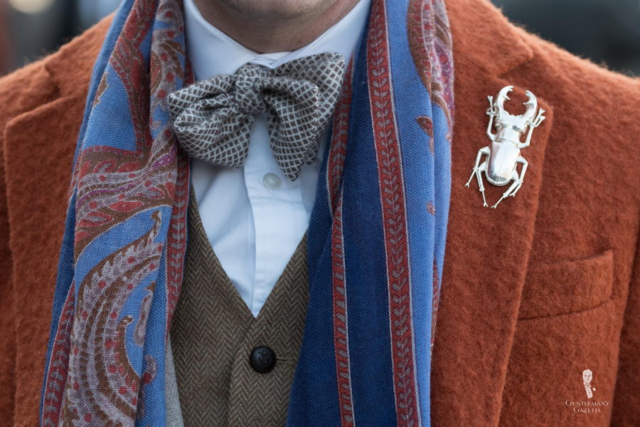
A fantastic color combination that is different yet not over the top. The boiled wool orange overcoat is not as bright as a casentino and more burnt orange. The brown vest pairs well with it, and so does the printed wool-silk scarf. The oatmeal jacket fits in just as well. With a huge scarab lapel pin, it is better not to add a pocket square. Otherwise, it is overloaded. For my taste, the lapel pin is distinctly too big, but each to his own.
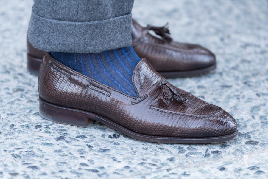
Superb combination of blue brown and gray. Nothing is flashy, yet it is sophisticated and unique. The lizard leather adds a bit of texture, and the gray flannel looks comfortable while the dark blue and royal blue striped socks tie it all together. It would have been much harder to achieve the same effect with a solid pair socks. To learn more about how to combine shoes, socks and pants, watch this video.
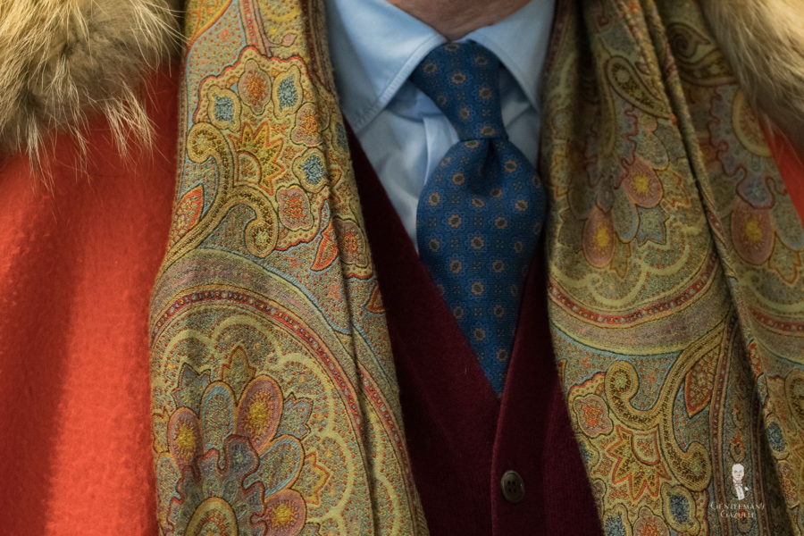
Here we see an orange Casentino overcoat with fur collar paired with a jacquard woven scarf, printed blue tie, burgundy cardigan, and light blue shirt

Just like the in the first picture, this coat has a similar texture but the dark brown color is even more subdued. The outfit is made special by the dark turtleneck sweater with a denim shirt on top of it. It is certainly a good way to make use of shirts that are otherwise too big, but if you can wear a turtleneck underneath your shirts, it means it is too big otherwise.
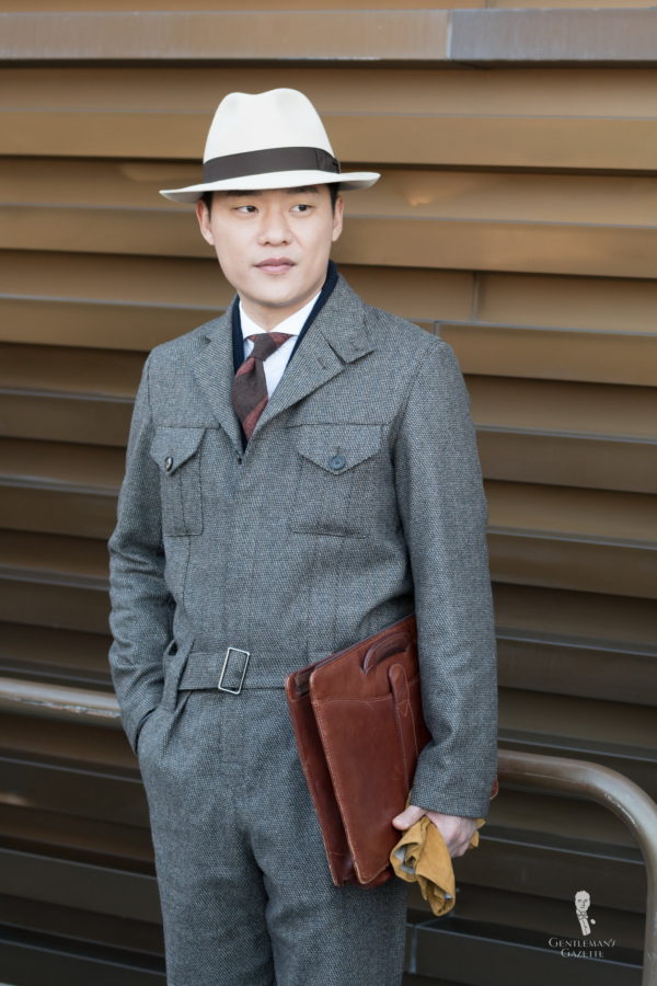
Seongsu Kim from Korea always puts thought into his outfits and his outfits are always unique without being flashy. First of all, he always wears hats and in this ensemble he is wearing a coverall, which is quite unusual. It used to be a work suit that was worn by people pumping gas a few decades ago. Now they have all but vanished, but Seongsu had it tailored in a suiting fabric thus creating a unique look with a simple textured beige and brown cloth.
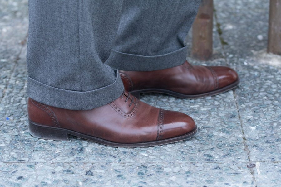
Even though you can find many flashy and unusual shoes at Pitti Uomo, a classic pair of round toe quarter brogue Oxfords in mid-brown will never disappoint because they are timeless, classic and easy to combine.
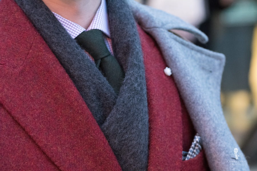
Sometimes, men think that they have to use many patterns to show how advanced their style is. However, this ensemble proves that a bit of color can go a long way. Although the shirt and pocket square have subtle patterns, the jacket, overcoat, scarf and tie are all mottled solids with twisted yarns that create an incredible depth of color. Even though the jacket is red and stands out, it works well with the other items.
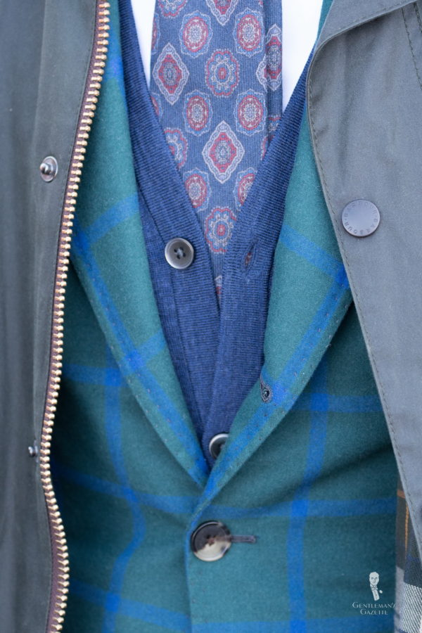
Mikolaj from blueloafers never wears boring outfits, and a closeup of his ensemble shows us why. Even though the color palette is limited to green and blue, the jacket is highly unusual with a green base and a bright blue windowpane. As this is a statement piece, the solid olive green Barbour wax jacket is well suited as a companion just like the dark blue cardigan and the printed wool tie.
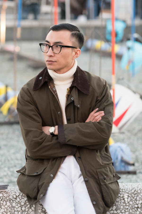
While I like the color combination of olive green and off-white the problem in this ensemble is the white pants. They are just too similar in color to the sweater yet different. Instead, a pair of brown, oatmeal or light gray pants would have looked much better, because they would have created a proper amount of contrast.
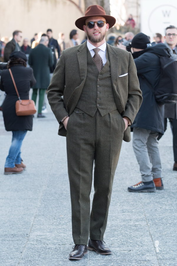
Kenneth from Bremen Germany got this beautiful green houndstooth vintage suit, but it was way too big for him. So he had it altered to make it fit, and because the fabric is thick, it drapes well and looks good on him. Even though the tie has slightly more contrast than the suit, it still has a pattern that is very similar to the houndstooth. Instead, a bolder pattern in a stripe and a color that ties that had and the suit together would have been preferable. For example, a burnt orange knit tie or a striped gray and orange striped cashmere wool tie would have been ideal.
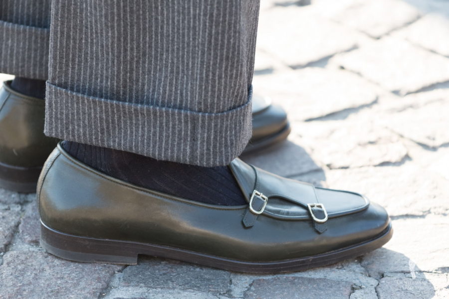
The green color of these shoes is wonderful and pairs well with the pants and socks. However, I am not a fan of the styling of the double monk style loafers. It serves no function whatsoever and is purely decorative. Of course, so are brogue holes these days but at least they have a history.
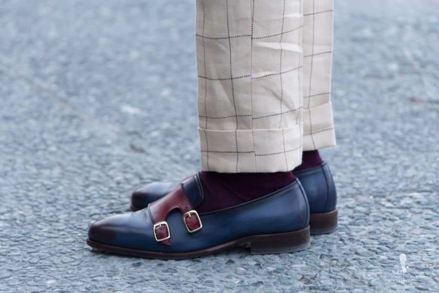
When you have a windowpane suit, it looks best if the lines align on the outside of the pants. While this is not easy to achieve, it is possible, and if you have a bespoke tailor, they should be able to get that right. RTW and MTM, will probably not be able to get it aligned. This is one of those details that shows if something is bespoke, or not.
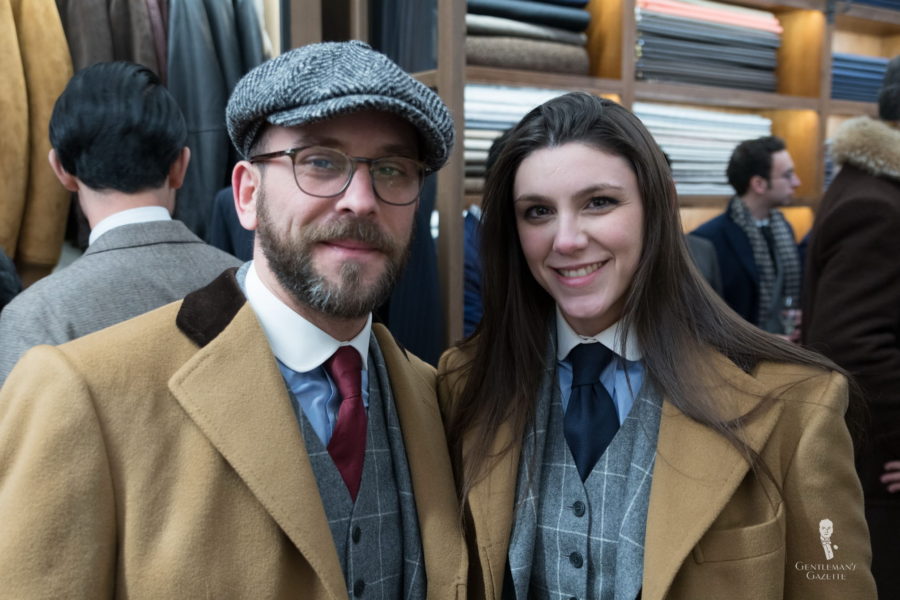
These two tailors from Madrid wore the same outfit, except for their ties. For their suit, they used the same VBC fabric that I used for a double breasted suit a while ago, and I love it. The camel overcoat and blue club collar shirts work with it too. Showing up in matching garments is certainly a way to get you noticed. While it works at a show like Pitti Uomo, I can’t think of a good real life event where I’d say go for it.
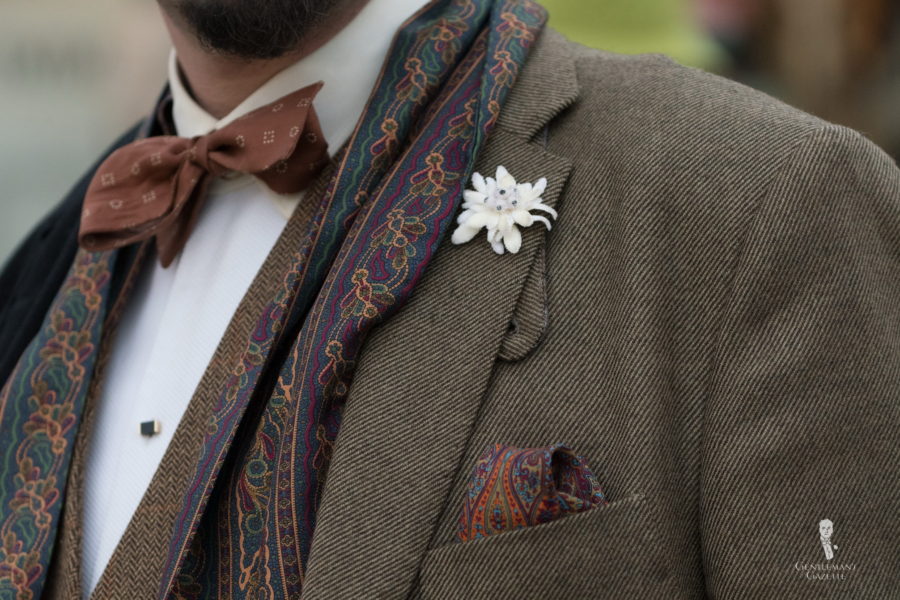
Fortunately, I spotted a few gents at Pitti with our boutonniere lapel flowers. My favorite ensemble was this one with a twill fabric, printed scarf and pocket square with an evening shirt, and bow tie, and an Edelweiss Boutonniere. To learn more about boutonnieres, take a look here.
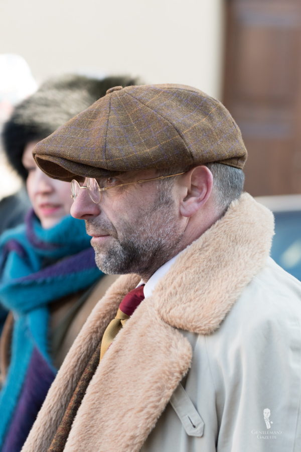
Pascal has a menswear store in Luxembourg, and he has a very distinct style that combines a vintage aesthetic with an English Country Gentleman and a bit of continental flair. Here we see him with old school glasses, shearling collar and lapel on a raglan trench coat and a striped tie.
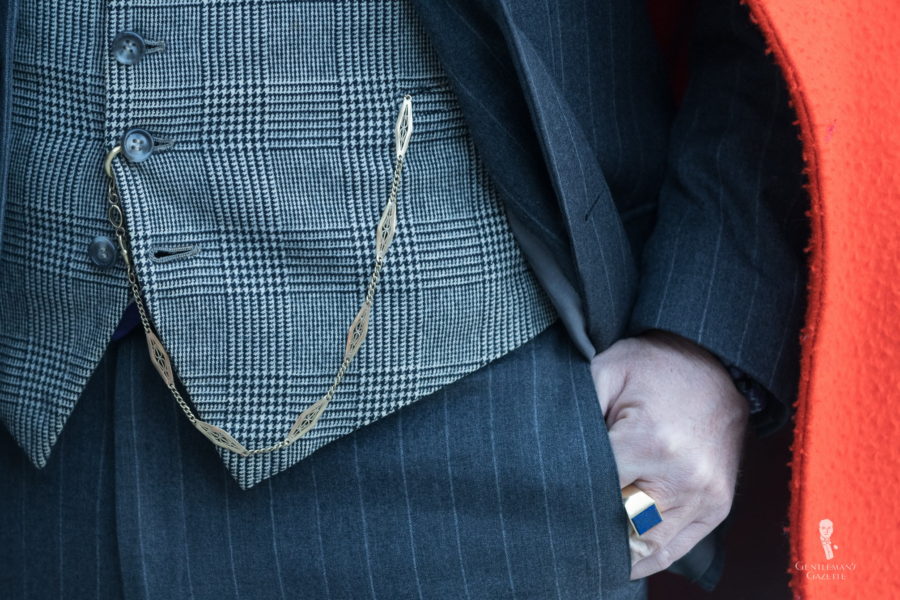
I was glad to see some gents wearing pocket watches with interesting watch chains such as this gentleman. Also not the Lapis Lazuli ring that would work well with these lapis cufflinks.
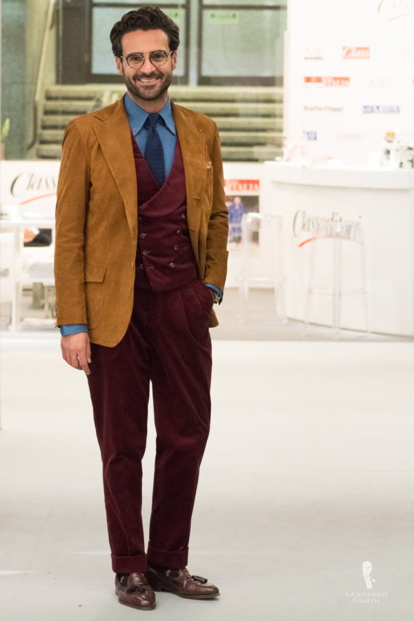
In classic menswear, leather is rarely made into a sport coat, but this one is so fine that you could hardly tell. The color is beautiful and rich, and it pairs well with the corduroy pants and vest.

Even though it is the middle of winter, sunglasses are all over the place at Pitti. This pair of shades seemed classic, yet unusual at the same time. Would you wear it?
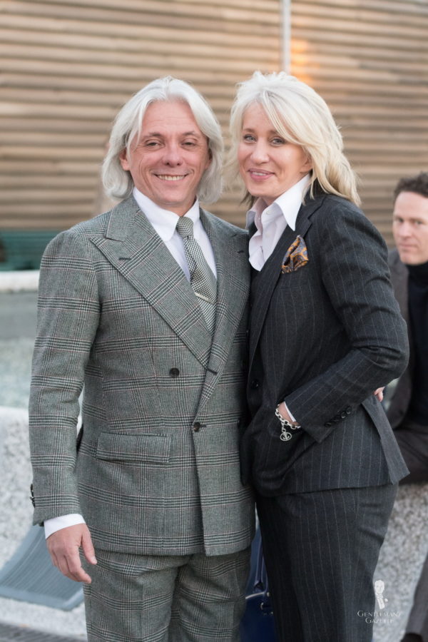
My fellow colleagues Sonya and Hugo usually show up in suits at Pitti Uomo. While Hugo prefers a double breasted silhouette with tall shirt collars and a necktie, Sonya often wears her shirts with an open neck.
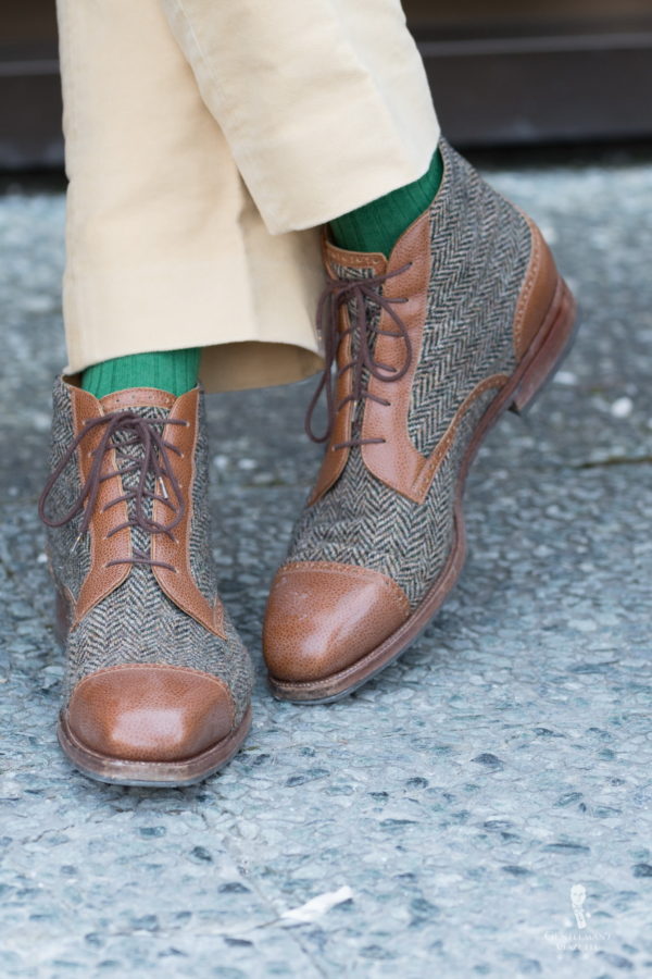
These bespoke tweed combination boots are certainly unique. Paired with bright green socks and khaki pants you have a wonderful winter ensemble. To learn more about How To Pair Shoes with Socks, take a look here.
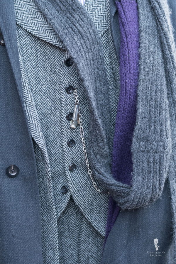
Monochromatic looks can be difficult to pull off, but Charley Marcuse from Emerson’s in Detroit did a great job of doing so in style. The covert overcoat is paired with a black and white herringbone three piece suit and a gray scarf with a touch of purple.
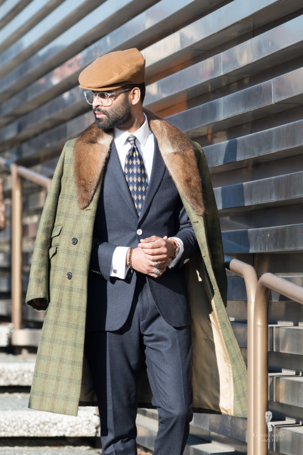
Fur coats or overcoats with fur collar are rare for men these days, even though they keep you warm and add the twenties or thirties aesthetics to your ensemble. I like this overcoat as it is green with a two tone triple windowpane. Obviously, the way it is worn is just for show, but I can see how this coat would be a great companion for the cold winter days.
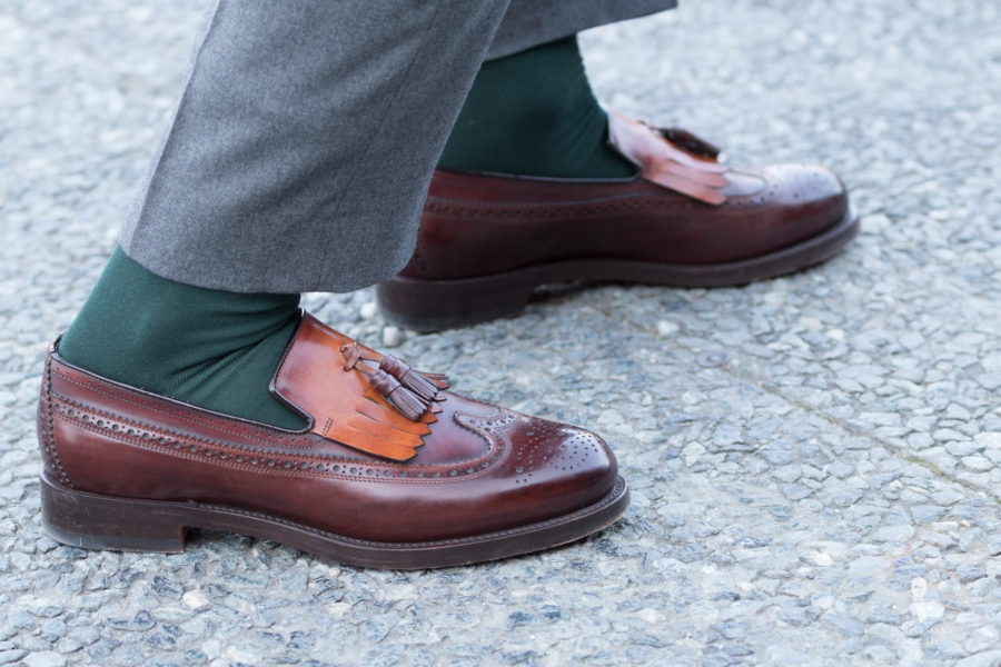
Fringes on tassel loafers and monk straps were popular during Pitti Uomo 91. Here are a few more variations.
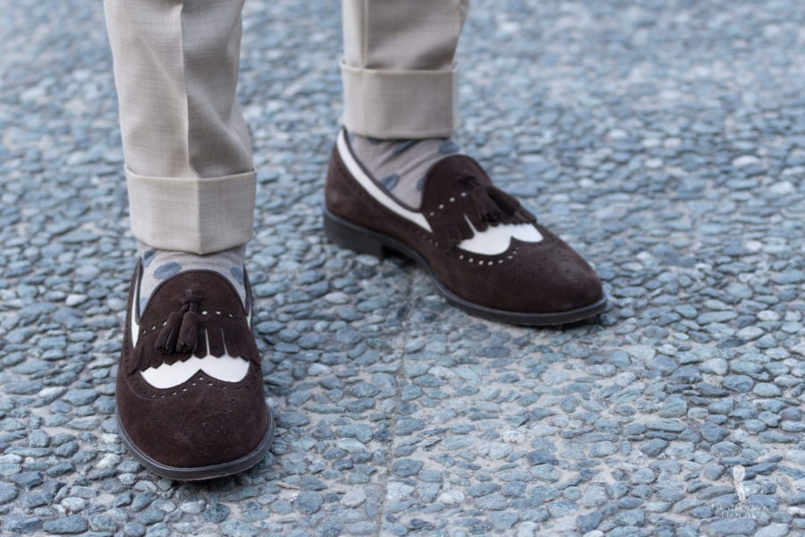
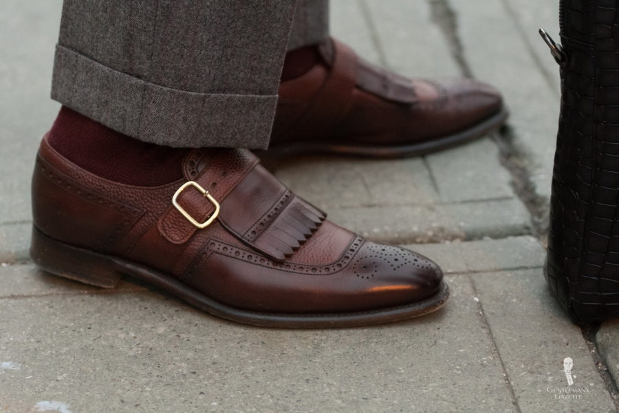
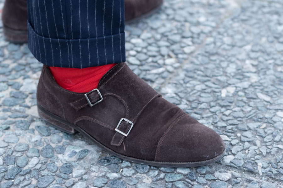
Red is a bold color, but it works with those suede, dark brown monk straps and the striped suit.
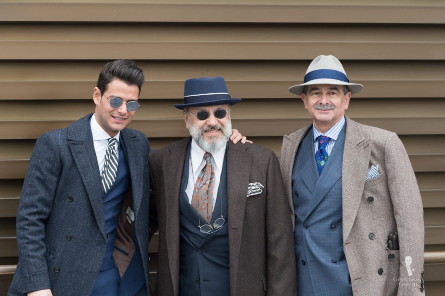
Interesting how different outfits can turn out even though the main colors are all very similar. Which one is your favorite and why? Please share in the comments below.
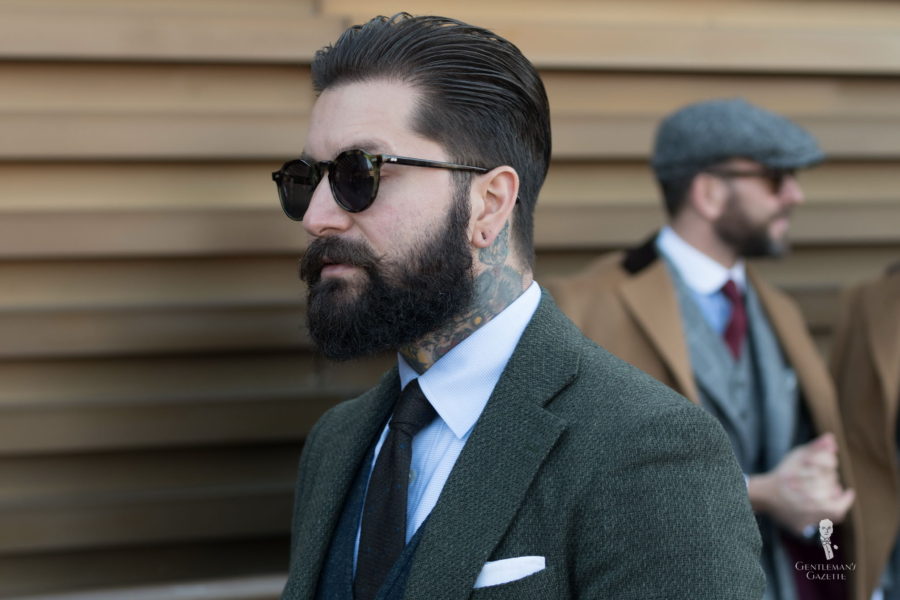
Green is often underrated in classic menswear, and while it is less formal than dark blue or gray, it makes for perfect informal ensembles.
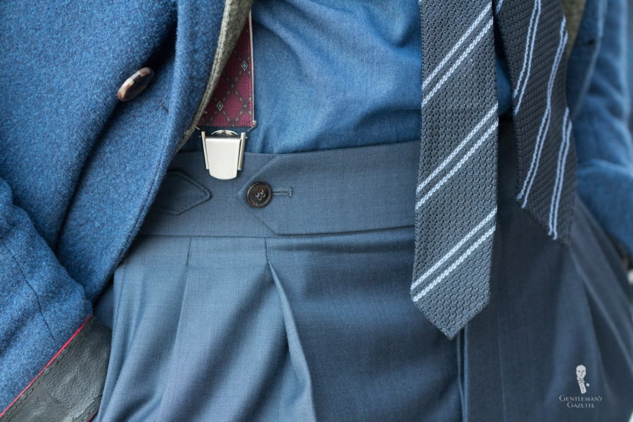
Personally, I am not a fan of clip-on suspenders because they look cheaper than the ones you button to your waistband. They may also damage your waistband or come off if they are of really poor quality, and in general their bands are never anything long lasting or beautiful. This ensemble combines grays and blues that are very similar to each other but not the same. Personally, I think a bit more contrast would have been preferable. What do you think? Please share in the comments below.
Great article, really enjoyed that, thank you!
Please tell me who makes the tie in the photo with the caption of “Beautiful detail by Grimod.”
I treat clip on suspenders and pre-tied bowties in the same way. they are things that people give me as gifts because they know I like to dress up. it only seems polite to wear them.
Regarding Seongsu Kim’s boilersuit, Suitsupply actually had one for sale in the past year. They give some more background on it: “Winston Churchill couldn’t manage without! Seventy-five years ago, with air raid sirens wailing over London, the British statesman wore a boiler suit over his own suit for the first time, to protect it against the dust of the bombardment. Thus the “siren suit” began its meteoric advance in popularity.” Difficult to wear under any real-world circumstances except for doing some sort of physical labour in it, which was its only appropriate use.
I saw Churchill’s Siren Suit in velvet in the Churchill War Rooms in Dec. Frankly, it looked a lot more unattractive than his version ;).
These were my favorites.
The one with the Edelweiss Boutonniere and the Green textured sport coat from Australia (the man in the back of this picture looked good from what I could see).
“as it looks like a solid color from afar”
Spot on. The net effect is, the closer people get ( the more interesting you become ) Visually anyway.
Definitely making me rethink Monk straps. As Sven points out, sock choice another detail I’d been overlooking for years. Black = BORING.
Compared to last year’s posts, seems a sense of, well SENSIBILITY has finally caught hold? Much more wearable colors and outfits. Outside the overalls, didn’t see one thing I wouldn’t be comfortable in!
Dear Raphael,,
thanks for this great article full of interesting and proper comments on all the shown outfits. I would like to add another comment, partly already raised by You when illustrating the bad alignement of the lines in non- bespoke windowpane trousers. The double breasted “Prince of Wales” jacket of Mr. Hugo Jacomet , the founder of ” Parisian Gentleman ” blog , offers an other example of a poor alignement of the checks , in spite of the fact that the jacket is bespoke and , as revealed by the presence of an extended fron dart , made by a neapolitan tailor. When looking at the right front quarter over the pocket ,there is a derangement of the checks, with an awful final effect. This is not only a technical limit of many neapolitan tailors but also of some Savile Row tailors. In my opinion some technical background in tailoring should be in the knowledge baggage of every elegant man, in addition to a good taste , in order to avoid of getting such poor results. The great Scholte, as one can see by observing the jacketrs of the Duke of Windsor, always utilized a single curved dart, starting under the armhole and ending over the back portion of the pocket , in order to preserve the original right alignement of checks and stripes in the frontal portion of the jackets